I'm a Visual Communication Designer working as Creative Director and Art Director with over two decades of experience. My most recent four-year chapter leading projects across Canada and the United States solidified my international strategic vision and team leadership capabilities.
A strategic, 360° perspective has driven my work across highly diverse domains: campaign conceptualization and execution, branding, editorial design, web design (UX/UI, prototyping), spatial design for events, packaging, wayfinding, and illustration.
I've delivered value for brands like Ford, Starbucks, AstraZeneca, Pfizer, and Augeo Affinity Marketing — transforming briefs into strategic solutions and high-impact visual systems.
A premium wine and spirits membership platform offering curated experiences, private tastings, and exclusive access to rare collections from around the world. The project required a full digital presence — from brand application to a responsive web experience.
Role: Creative Director, Art Director, UX/UI DesignerDeliverables: Brand Design, Web Design, UI System
A personal project I founded as a children's audiobook and storytelling platform. Original stories designed to foster core values in kids, with a vibrant yellow identity, custom character illustrations, and a full UX/UI digital experience.
Comprehensive brand identity system for Ford's Guest Experience program, developed in collaboration with a partner agency. Contributed to the design of the brand lockup, the full Pantone color palette, and the brandbook, while overseeing the applications suite and directing the video photoshoot to ensure a cohesive visual narrative across the program.
Role: Art DirectorDeliverables: Brandbook, Lockup, Color System, Applications, Video Direction
Event visual identity for the "TakeTheLead" conference. The project featured a bold typography system and a custom gradient mesh identity, applied across an extensive suite of branded applications — from stage design to large-scale venue signage.
Role: Art DirectorDeliverables: Event Identity, Typography, Color System, Spatial Design, Digital
Email marketing campaign system for three spirits brands — High West Distillery, Unshackled (The Prisoner Wine Co.), and Mi CAMPO Tequila. Each with its own visual voice, unified by a shared campaign structure.
Role: Art Director, Digital DesignerDeliverables: Email Templates, Campaign Design, Multi-Brand Systems
Visual identity creation for the "Own It" conference, establishing a bold geometric system that served as the primary engine for all subsequent applications. Centered on a precise typographic pairing of Changa and Bahnschrift, the identity acted as the strategic anchor for the entire brand deployment.
Role: Art DirectorDeliverables: Event Identity, Lockups, Typography, Collateral, Social Media
A dynamic and modular visual system for the "Our Time" 2024 National Business Meeting. Built on a digital-inspired "pixel" geometry, the identity uses a bold color language and flexible grids to create a cohesive atmosphere across large-scale spatial branding and digital touchpoints.
Role: Art Direction, Visual IdentityDeliverables: Event Identity, Branding System, Environmental Graphics, Digital Assets
Full visual identity for a food brand — "La papa que ayuda." Custom wordmark, geometric pattern system, packaging, mobile app, and complete brand applications.
Exhibition and spatial design for 1664 Beer — "La Rosé Room." Branded bar, photo-op moment with oversized bottle, and French bistro-inspired exhibition wall with neon signage.
Role: Art Director, Spatial DesignerDeliverables: Bar Design, Photo-Op Installation, Exhibition Wall
Art DirectionPublic AwarenessEnvironmental Graphics
POP — Civic Awareness Campaign
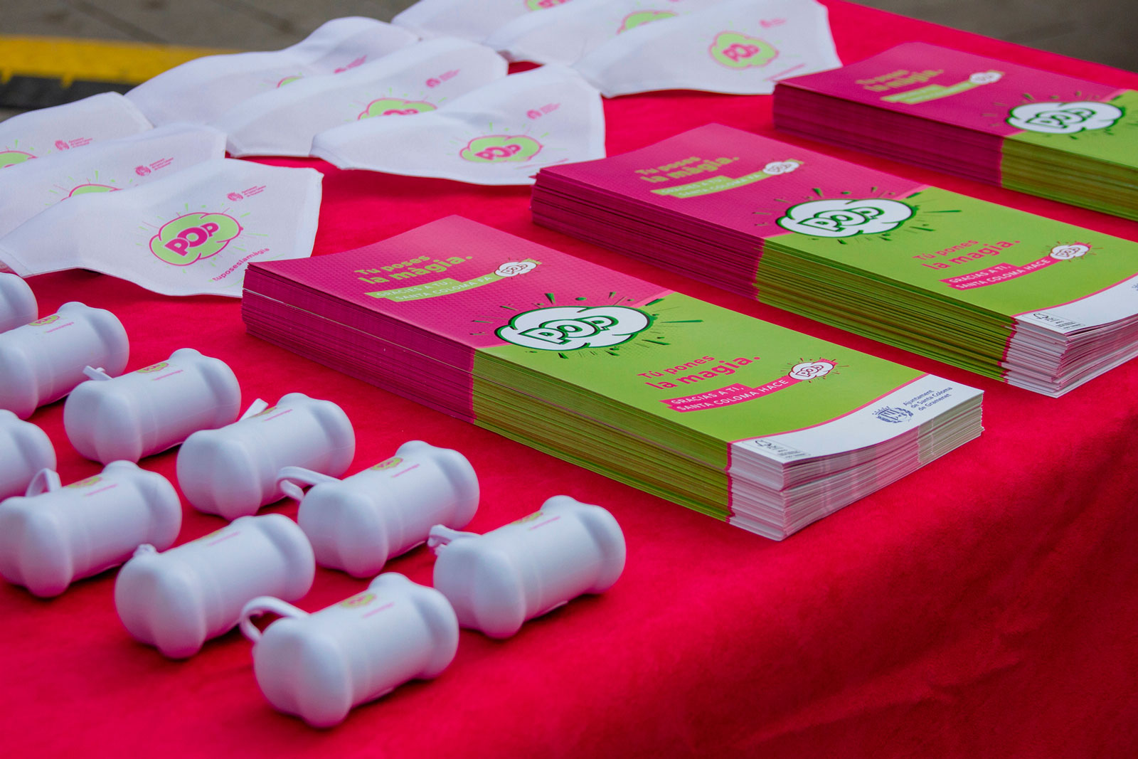
A high-impact visual identity and public awareness campaign created to promote responsible waste management in Santa Coloma de Gramenet. Featuring a bold, minimalist graphic system, the project transforms civic duty into a dynamic urban conversation through a comprehensive suite of outdoor and digital assets.
Role: Art Direction & Graphic Design (Collaborative Agency Project)Deliverables: Campaign Branding, Outdoor Advertising, Social Media Assets, Urban Signage
The creative challenge for Barrel Hunter Club was to visually articulate the "Club" concept through the lens of contemporary luxury. This wasn't just a rebrand; it was about building a brand ecosystem that exudes exclusivity, expertise, and sophistication at every touchpoint.
Branding & Strategy — During the branding phase, we developed a robust brand architecture, selecting a color palette and typography designed to reinforce the sense of belonging to an elite circle. The resulting identity manual is more than a set of guidelines — it is a statement of intent. Here, design semiotics align with business strategy to project authority within the premium spirits sector.
Digital Experience — The website development followed a rigorous methodology: from information architecture and user flow definition to a UX-centered wireframing phase. The result is a high-performance digital environment built on a scalable component system, where the UI serves as a seamless extension of the brand's visual identity.
Brand Identity
Brand mark and wordmark on light and dark applications — teal, gold, and cream palette
Brand Architecture
"In Pursuit of the Extraordinary" — primary lockup, horizontal variant, and compact icon system
Brandbook
Brand manual — positioning, personality, voice ("Warm & Worldly Storyteller"), typographic hierarchy, and visual direction
Design System
Typography & colour palette.
Accent Font
Cormorant Garamond
Aa Bb Cc Dd Ee Ff Gg Hh Ii Jj Kk Ll Mm Nn Oo Pp Qq Rr Ss Tt Uu Vv Xx Yy Zz
Main Font
Fira
Aa Bb Cc Dd Ee Ff Gg Hh Ii Jj Kk Ll Mm Nn Oo Pp Qq Rr Ss Tt Uu Vv Xx Yy Zz
Colour Palette
#CCB88F
#4A2F3D
#383838
#EBEBEB
#FAFAFA
Brand Applications
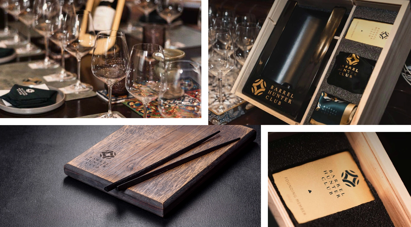
Tasting experience — branded table settings, oak serving boards, membership welcome box, and founding member credentials
img/
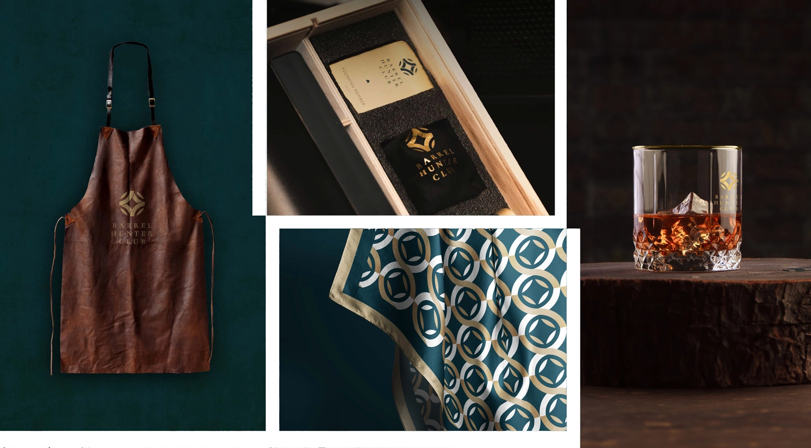
Premium collateral — leather sommelier apron, pattern silk scarf, gift box, and branded crystal glassware
Hero
Gold foil embossed logo on textured teal stock — tactile luxury at the first point of contact
Teacuentros is a personal project I founded as a children's audiobook and storytelling platform, created by a team of artists producing original and educational stories designed to foster core values in kids. The platform offers proprietary tales, curated collections across genres — comedy, science fiction, fantasy, adventure — and an immersive listening experience designed for young audiences. As founder, I led the project from inception, ensuring that the proprietary content remained the heart of the platform's value proposition.
The challenge was designing a digital experience that would delight children while remaining intuitive for parents. The interface needed to feel playful and warm without sacrificing usability — handling story browsing, audio playback, personalization options, gift purchases, and user account management in a cohesive flow. As both founder and lead designer, I created the entire branding from scratch, which served as the foundation for the project's visual structure and the development of the web experience, ensuring both grew as a unified concept.
The design process covered full UX/UI — from information architecture to a bespoke typography system (Nexa in Light, Regular, and Heavy weights), a vibrant yellow-driven color palette, and a comprehensive UI component library. This included my personal creation of the custom character illustrations for each story and the website itself, resulting in responsive layouts optimized for both desktop and tablet that reflect the branding's original creative vision.
Client Spotlight
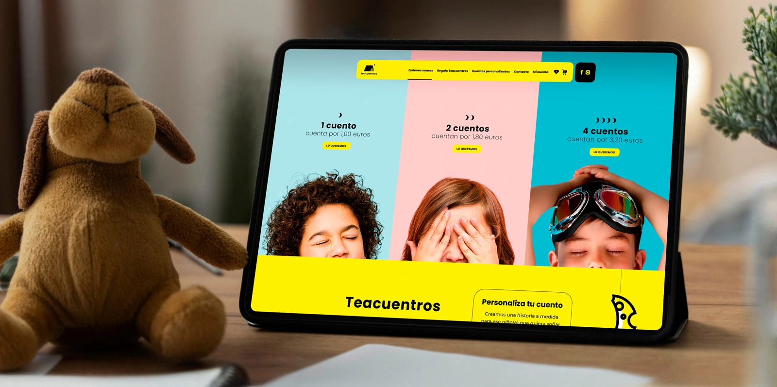
Homepage hero on tablet — vibrant pricing tiers with playful photography
UI Component Library
Story cards, catalog grid, audio player cards, button system, account management, and form elements
Design System
Typography & colour palette.
Primary Font
Nexa Light
Aa Bb Cc Dd Ee Ff Gg Hh Ii Jj Kk Ll Mm Nn Oo Pp Qq Rr Ss Tt Uu Vv Xx Yy Zz 0123456789
Display Weight
Nexa Heavy
Aa Bb Cc Dd Ee Ff Gg Hh Ii Jj Kk Ll Mm Nn Oo Pp Qq Rr Ss Tt Uu Vv Xx Yy Zz 0123456789
Colour Palette
#FFE500
#1A1A1A
#FFFFFF
#B8E4F0
#F5C5D0
#7DD4E8
#808080
Nexa typographic system alongside full homepage design
Final Screens
Complete responsive website — homepage, story catalog, about, gifting, pricing, contact, and account flows
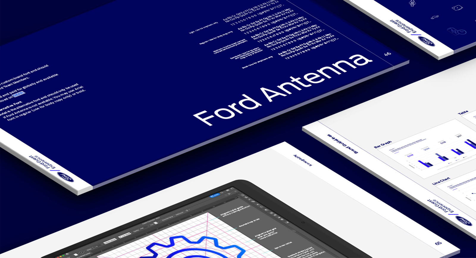
Ford Guest Experience is an internal initiative focused on elevating the customer journey at every dealership touchpoint. Developed in creative collaboration with a specialized agency partner, the program required a complete brand identity system that would live alongside the master Ford brand while establishing its own distinct visual voice. My involvement in the process ensured that the sub-brand remained flexible enough to span dealer training materials, digital presentations, and experiential collateral while maintaining strict alignment with Ford's global standards.
The challenge lay in building a visual framework capable of scaling across job aids and large-scale deployments. Working within the collaborative team, we focused on a system that respected the Pantone-specified color palette and the proprietary Ford Antenna typeface. The resulting identity balances the corporate heritage of the Ford Blue with a modern approach to the dealer-customer relationship.
Deliverables for this partnership included the co-branded lockup, a comprehensive brandbook, and the full palette (Ford Blue, Twilight, Grabber). The project also involved developing brand pillar moodboards and an extensive applications suite deployed across the dealer network, reflecting a unified effort to modernize the brand's touchpoints.
Brand Lockup
Co-branded lockup — Ford oval + Guest Experience wordmark with 10% clear space grid
Colour Palette
Ford Blue (294), Ford Twilight (2766), Ford Grabber (2126), and the complete gray scale system
Design System
Typography & brand colours.
Brand Font
Ford Antenna
Custom brand typeface — Light, Regular, Medium, Bold. Used across all Guest Experience communications.
Alternative
Arial
Fallback typeface when Ford Antenna is unavailable. Regular and Bold weights only.
Colour Palette
Ford Blue
Twilight
Grabber
Black
Dark Gray
Mid Gray
Light Gray
Pale Gray
Brandbook & Typography
Brandbook spreads, Ford Antenna typography, and Illustrator icon grid
Brand Pillars
Authentic, Effortless, Passionate, and Purposeful Ingenuity — each with visual moodboard
TakeTheLead was the flagship conference for Allergan Aesthetics, bringing together leadership and practitioners for a high-impact program of keynotes and workshops.
The visual identity was designed to feel aspirational and energetic—reflecting the event's tagline "aspire | align | ascend"—while staying seamlessly within the Allergan Aesthetics brand ecosystem. A vibrant gradient mesh system served as the visual foundation, paired with Noto Serif Display for elegant editorial headlines and Montserrat for clean, functional communication.
The creative focus was on a comprehensive brand deployment, ensuring the event's identity resonated across every touchpoint of the experience. This involved a strategic scale-up of the visual system into the event's physical and digital environment, from immersive high-format spatial graphics and main stage art direction to a cohesive suite of digital and physical assets. The result was a unified and premium atmosphere that maintained brand consistency throughout the entire multi-day program.
Visual Identity & Typography
Noto Serif Display + Montserrat typographic pairing with identity variations
Colour Palette
Brand colour system on pin buttons — #f80084, #17ffb1, #19cdcb, #b0ff24, #ffffff
Design System
Typography & gradient mesh.
Display Font
Noto Serif Display
Elegant editorial serif for headlines, stage graphics, and hero lockups.
Body Font
Montserrat
Clean geometric sans-serif for body copy, wayfinding, and badges.
Colour Palette
#f80084
#17ffb1
#19cdcb
#b0ff24
#ffffff
Branded Collateral
Attendee tote bags, photo-ID badges, and branded lanyards
Event Website
Responsive event landing page — schedule, speaker profiles, and registration
Large-Scale Applications
Large-format convention center billboard.
Exhibition booth — gradient mesh backdrop and branded furniture
Constellation Brands needed a cohesive email marketing campaign system across three spirits brands: High West Distillery, Unshackled (by The Prisoner Wine Co.), and Tequila Mi CAMPO.
Campaign flows covered event follow-ups, survey invitations, thank-you acknowledgments, and $5 digital gift card redemption. The challenge was designing templates for three wildly different aesthetics while maintaining a unified UX.
High West got teal and copper. Unshackled received black-and-gold luxury. Mi CAMPO was designed with vibrant reds and turquoise reflecting its "Live Louder, Baby!" energy.
High West Distillery
Survey thank-you, gift card redemption, and event follow-up — teal and copper
Visual identity creation for Novartis' flagship internal event, designed to bring together teams for a day of collaboration and strategic alignment under the rally cry "Own It."
The project centered on the development of a bold, energetic logo and visual system capable of standing on its own while co-existing with the Novartis corporate brand. A vibrant orange and amber palette, paired with dynamic diamond-shaped geometric patterns, served as the visual backbone — conveying momentum, confidence, and forward energy.
This core design system acted as the foundation for the entire project, spanning a precise typographic pairing (Changa for bold display headlines and Bahnschrift for clean body copy) and the creation of six alternative lockup variations to meet different format requirements. From this central identity, a comprehensive applications suite was deployed, including branded assets and digital templates, ensuring a unified and high-impact brand presence throughout every touchpoint of the conference.
Typography & Colour Palette
Changa + Bahnschrift with diamond pattern system in #fcb017, #ffffff, and #e34d17
Design System
Bold geometry, own energy.
Display Font
Changa
Bold condensed display typeface for headlines, lockups, and large-format signage.
Body Font
Bahnschrift
Clean variable sans-serif for body copy, badges, and wayfinding.
Colour Palette
#e34d17
#fcb017
#ffffff
Alternative Lockups
Six lockup variations — vertical, horizontal, icon-forward, and compact
Branded Collateral
Attendee pin buttons across brand colour variations
Branded backpack, photo-ID badges, and Novartis co-branded lanyard cards
Social Media
Instagram story templates — event promotion and photo overlays
Event Identity, Branding System, Environmental Graphics, Digital Assets
Live it. Drive it. Own it.
"Our Time" served as the conceptual core for Astellas' 2024 National Business Meeting. The challenge was to create a visual identity that felt urgent, energetic, and forward-looking, perfectly encapsulated in the event's rally cry: Live it, Drive it, Own it. The goal was to transform a corporate gathering into an immersive brand experience that reinforced leadership and collective momentum through a high-impact graphic language.
The identity is built on a modular "digital pixel" system that conveys movement and evolution. By breaking down the grid into varying square patterns, the visual language achieves a sense of "data in motion." This geometric framework is anchored by a high-contrast palette — predominantly Astellas Red and black — complemented by secondary accents of blue, amber, and green to differentiate various program segments and workshop tracks while maintaining a cohesive brand ecosystem.
Event Identity
Main event lockup featuring the "pixel-grid" geometry and the core "Live it, Drive it, Own it" rally cry system.
Typography & Colour Palette
Astellas Red (#d6053b), Blue (#0030d1), Amber (#faa600), Green (#00d970), and the DIN Pro Condensed typographic hierarchy.
Design System
Pixel geometry, bold energy.
Display Font
DIN PRO Condensed
Black Italic weight for headlines and display. Italic weight for body copy and secondary communications.
Pattern System
Modular Pixel Grid
A digital-inspired "data in motion" system built from varying square patterns. Scales from badges to large-format environmental graphics.
Colour Palette
#d6053b
#0030d1
#faa600
#000000
#00d970
Branded Collateral
Custom attendee credentials and badge variations integrating the modular grid system for distinct user role identification.
Full merchandise suite including personalized stationery, premium notebooks, and technical pens with integrated brand patterns.
Environmental Graphics
Large-format environmental graphics, including vertical banners and hanging panels for high-visibility spatial brand deployment.
Comprehensive signage suite featuring directional panels, wall graphics, and a multi-color calendar system for session tracking.
Main Stage
Main stage art direction with digital screen assets, motion-ready backdrops, and branded podiums for keynote presentations.
Papayuda is a food brand built around a simple proposition: a burst of flavor and fun in every bite. The project required a complete visual identity from scratch — one that would communicate a young, dynamic brand with the playful attitude suggested by its own name (papa + ayuda). The goal was to create a warm and approachable brand that stands out in a crowded market through a bold personality and a "flavor-packed" visual language.
The identity centers on a custom, vibrant bubble-lettered wordmark paired with a small potato icon, giving the brand a playful and tactile personality. A rich brown and amber color palette grounds the identity in warmth and earthiness, while energetic accent colors (green, orange, and teal) bring a "sassy" and vibrant edge. This branding system was designed to convey both the explosion of flavor and the brand's close-knit character, ensuring that every touchpoint invites interaction.
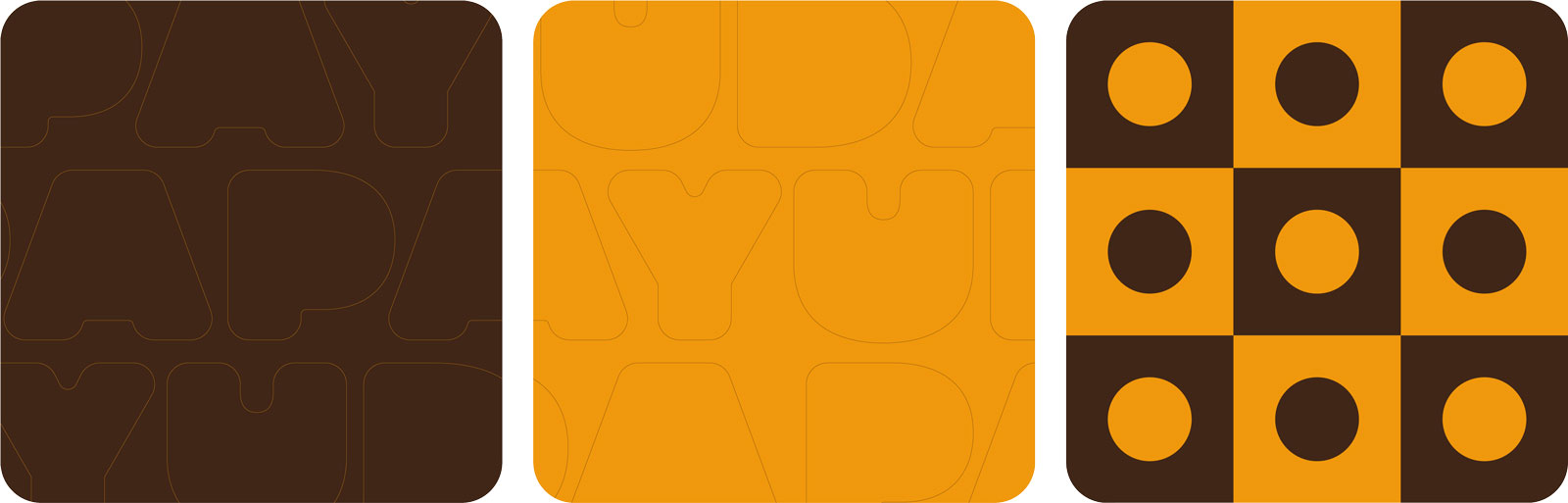
A geometric pattern system — built from circles, checkerboards, and the stacked logo mark — extends this bold visual structure across packaging, mobile app screens, social media, and embossed print applications. From the packaging design to the digital presence, every element reinforces Papayuda's generous character, making it clear that this is more than just a simple potato — it's a memorable culinary experience.
Brand Mark
Stacked logo mark on dark brown and amber backgrounds — bold, circular, unmistakable
Wordmark
Custom bubble-lettered wordmark — outline construction on neutral stock
Typography
Gelica — brand typeface in ExtraLight, Regular, SemiBold, and Black weights
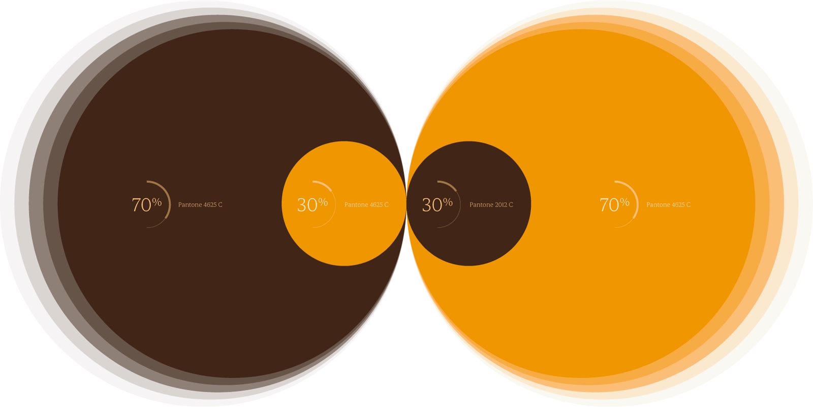
Colour System
Pantone 4625 C (70%) and Pantone 2012 C (70%) — warm brown and amber as the core palette
Design System
Warm, earthy, generous.
Wordmark
PAPAYUDA
Custom bubble-lettered logotype — rounded, tactile forms reflecting the brand's playful and approachable personality.
Brand Typeface
Gelica
ExtraLight, Regular, SemiBold, and Black. Warm serif with character — used across all branded communications.
Colour Palette
Brown
Amber
Green
Orange
Teal
White
Pattern System
Three pattern tiles — typographic, letterform, and checkerboard circle grid
Packaging
Product packaging — geometric brown and amber pattern system applied to food boxes
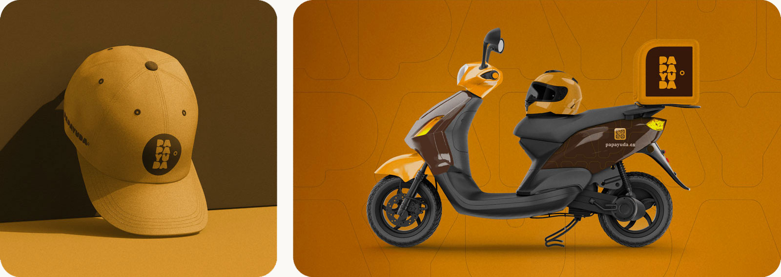
Brand Applications
Branded cap and delivery scooter — identity in motion across the city
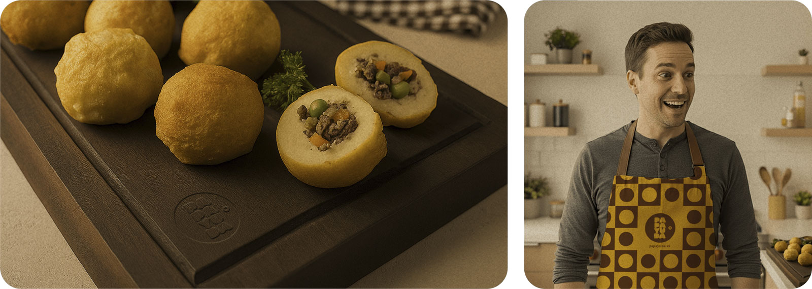
Product photography on branded serving board + patterned apron in action
Outdoor
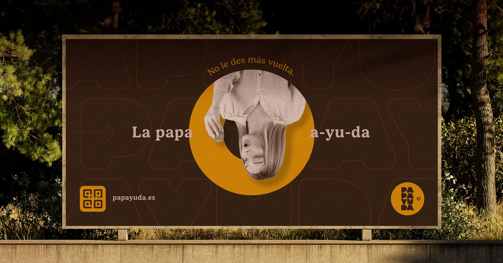
Outdoor billboard campaign with the brand's signature circular framing
1664 Beer launched its Rosé variant with an immersive brand experience designed to embody "Drink Fashionably."
The spatial design comprised three experiences: a branded bar with bottle-lined shelving; a photo-op moment with an oversized 1664 Rosé bottle; and "La Rosé Room" — a full-scale French bistro-inspired exhibition wall with neon signage and café furniture.
Royal blue and blush pink ran through every element, creating a cohesive visual journey that balanced brand heritage with fashion-forward aesthetics.
Design System
French heritage, fashion-forward.
Spatial Concept
La Rosé Room
Full-scale French bistro façade with neon-lit archway, art gallery, café seating, and product showcase.
Tagline
Drink Fashionably.
The brand line anchored every touchpoint — from vertical typography to the oversized bottle photo-op.
Colour Palette
Royal Blue
Blush Pink
Terracotta
White
Bar Installation
Branded bar — bottle-lined shelving, vertical 1664 typography
La Rosé Room
Full-scale exhibition — French bistro façade, neon archway, art gallery, café seating
Photo-Op Moment
Oversized 1664 Rosé bottle with blush-pink backdrop
Ajuntament de Santa Coloma de Gramenet (Barcelona)
Year
2019
Role
Creative Director, Art Director
Scope
Branding System, Outdoor Advertising, Social Media Assets, Urban Signage
Tu poses la màgia.
Developed in collaboration with a partner agency for the Santa Coloma de Gramenet City Council, "POP" is a public awareness initiative designed to tackle urban waste management and promote social responsibility. The campaign focuses on the impact of individual actions on the city's collective environment, urging citizens to move away from negligence and adopt a committed, conscious approach to disposing of waste.
The visual strategy relies on a bold, high-contrast aesthetic that demands attention in the urban landscape. By using a vibrant color palette and minimalist graphic elements, the campaign transforms a serious civic issue into a modern and energetic dialogue. The identity was designed to be highly versatile, ensuring that the message remained impactful across various formats, from large-scale street banners to digital social media touchpoints, all while maintaining a consistent and professional tone that reflects the council's commitment to a cleaner city.
Campaign Identity
Main campaign lockup featuring high-contrast typography and the core "POP" visual identity system.
Public Launch
Urban environmental graphics and outdoor advertising layouts designed for high-impact visibility in public spaces.
Campaign Collateral
Comprehensive social media toolkit including energetic layouts and strategic messaging for digital engagement.
Community engagement — branded pet bandana extending the campaign into everyday civic life.
Outdoor Advertising
Large-format street banners and transit signage system deployed across the city's waste management touchpoints.
Urban Applications
Full metropolitan bus wrap — campaign identity applied to public transit fleet.
Integrated campaign collateral and urban applications designed to promote long-term civic behavioral change.